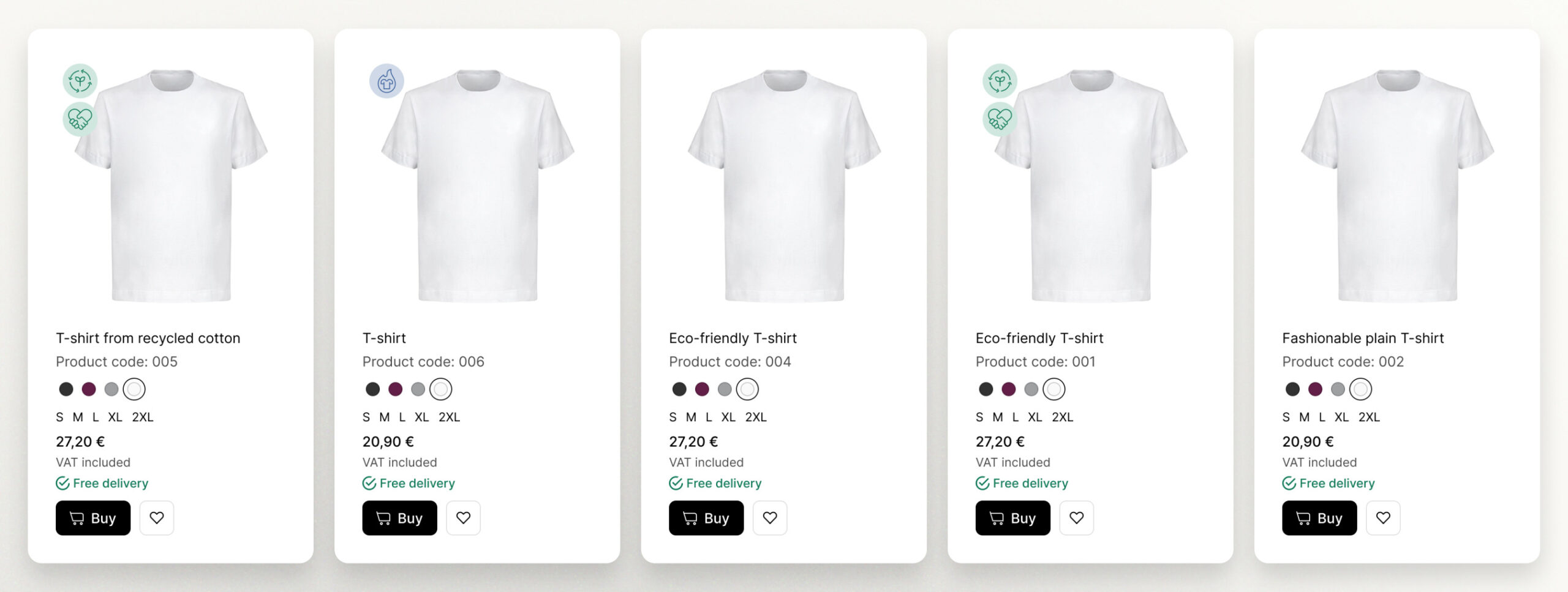
This master’s thesis, conducted within the UX Design program at JU University, systematically investigates the profound influence of visual framing and the precision in articulating specific terms in information framing on consumers’ purchasing decisions, specifically in the domain of sustainable fashion products within an online context. The utilization of a high-fidelity prototype for a clothing website played a pivotal role in our study, functioning as a versatile tool for data collection. On the category page, consumers encountered six similar products representing different scenarios. While all products shared the same style, distinctions were made in the specificity of their names and the use of visual framing. To enhance realism, two products served as control group items, lacking sustainability features and priced differently from sustainable alternatives. In a meticulous quantitative analysis involving 84 participants, complemented by insightful qualitative perspectives, the study unveils compelling insights. Notably, the findings establish a significant and positive correlation between sustainability and visual framing, underscoring the influential role of visually presented information in shaping favorable decisions towards sustainable choices. Interestingly, no substantial relationship was observed between the specificity of terms and considerations for sustainability.
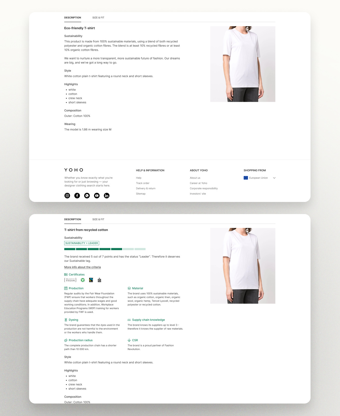
The product variants include those with icons and precise language, contrasting with counterparts lacking icons and using general terms. Control groups, devoid of icons and presented with broader language, augment the study’s depth, facilitating a comprehensive analysis of user responses and preferences. This approach aims to unveil nuanced patterns in user interactions for a more holistic understanding.
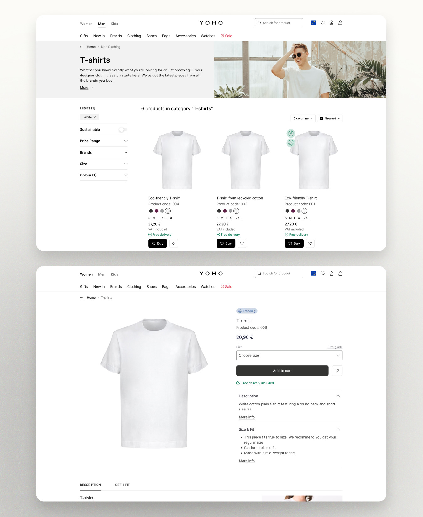
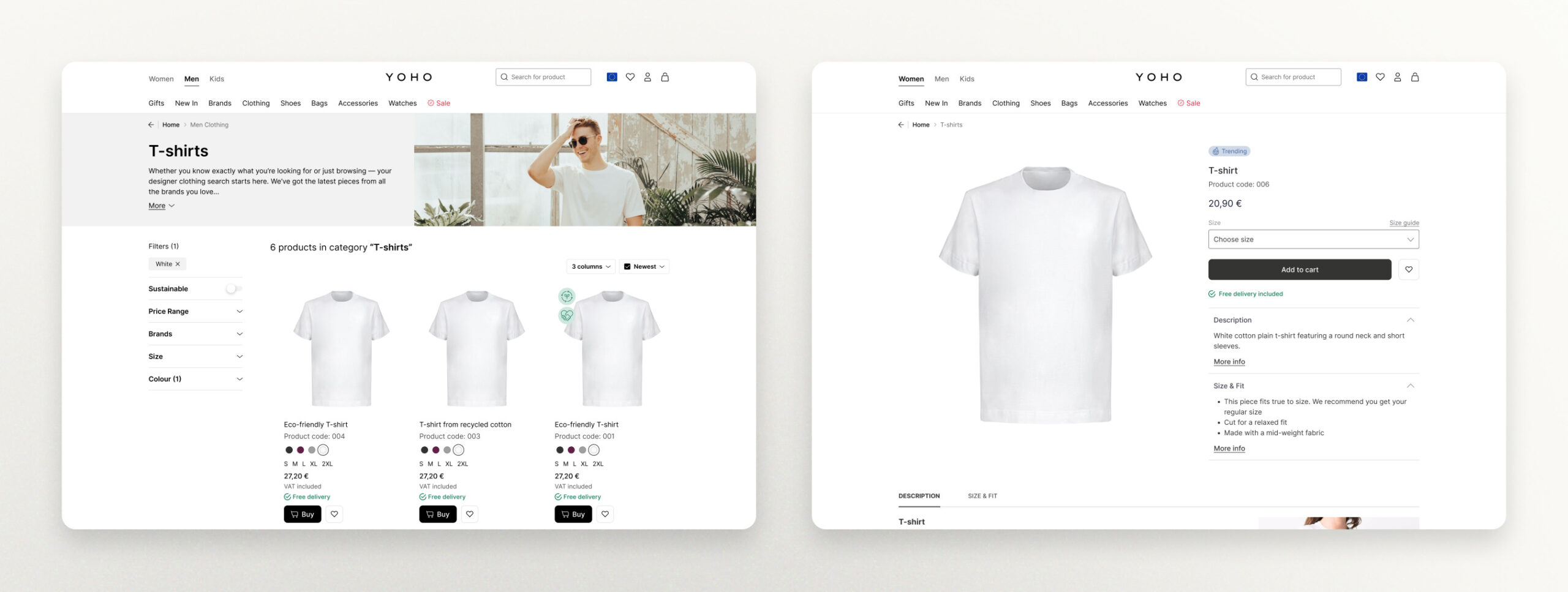
The category page and product detail are designed with simplicity in mind, adhering to e-commerce design principles and amalgamating elements from popular online shops.
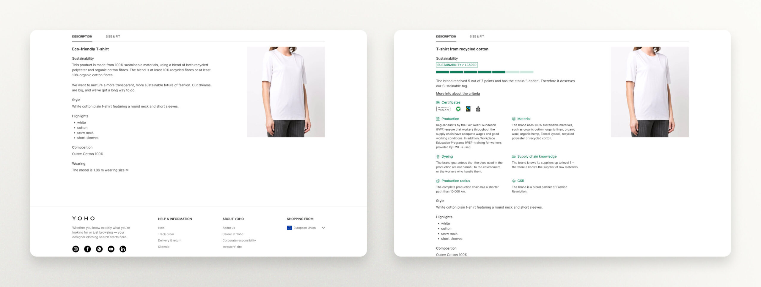
The product details with generic terms and no icons are positioned on the left, while on the right side, there is the product detail with icons and specific terms—mostly chosen product.