As a personal project, I took on the exciting challenge of redesigning the Lipton homepage, aiming to breathe new life into the digital representation of this renowned brand. The original interface suffered from low-quality imagery, a lack of user-friendliness, and not engaging content. In response, I reimagined the homepage by segmenting it into engaging content blocks, adorned with high-resolution visuals that authentically reflect Lipton’s brand essence. This redesign user experience while captivating and motivating visitors, encouraging them to explore the brand further.
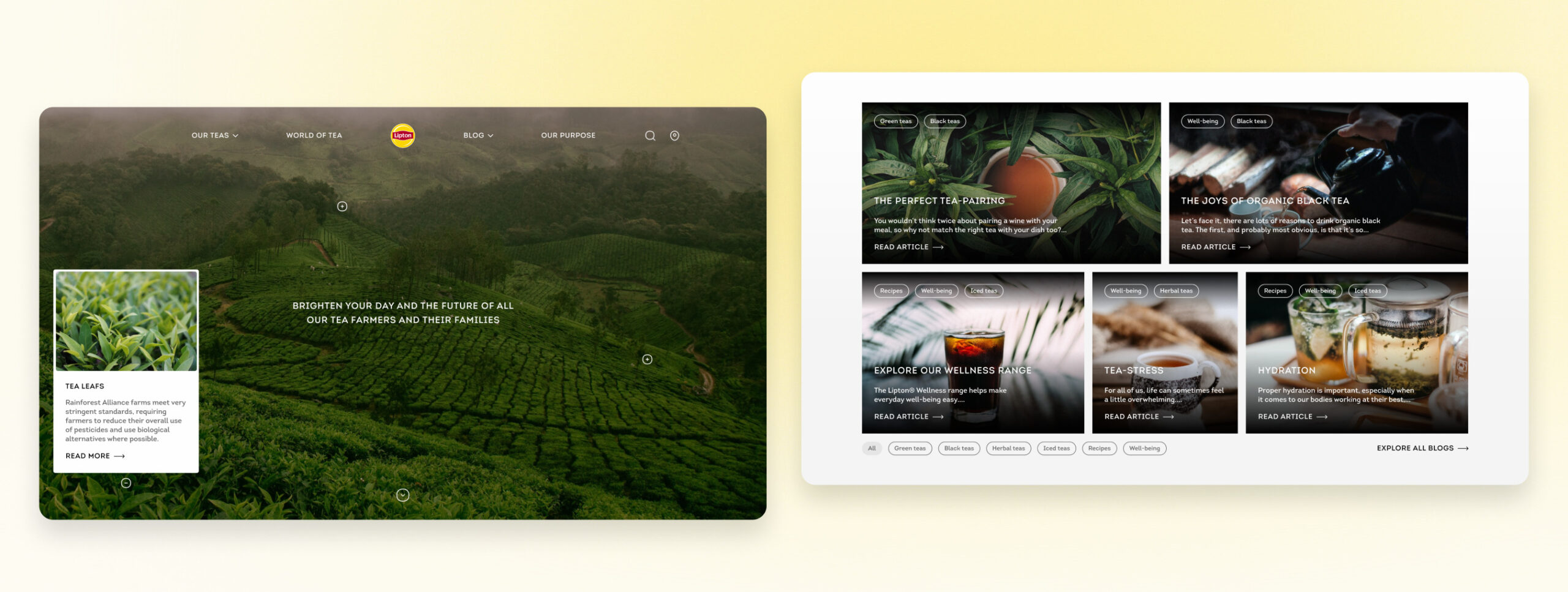
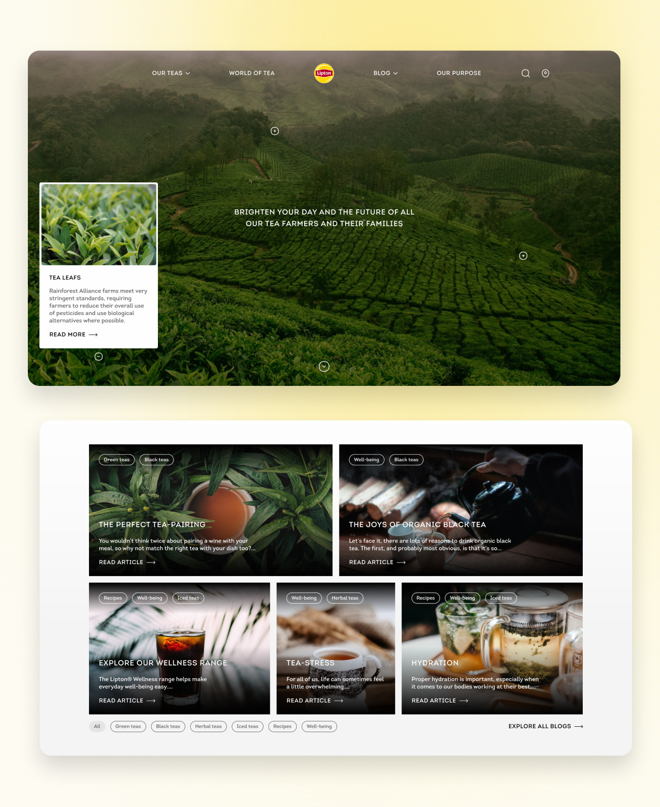
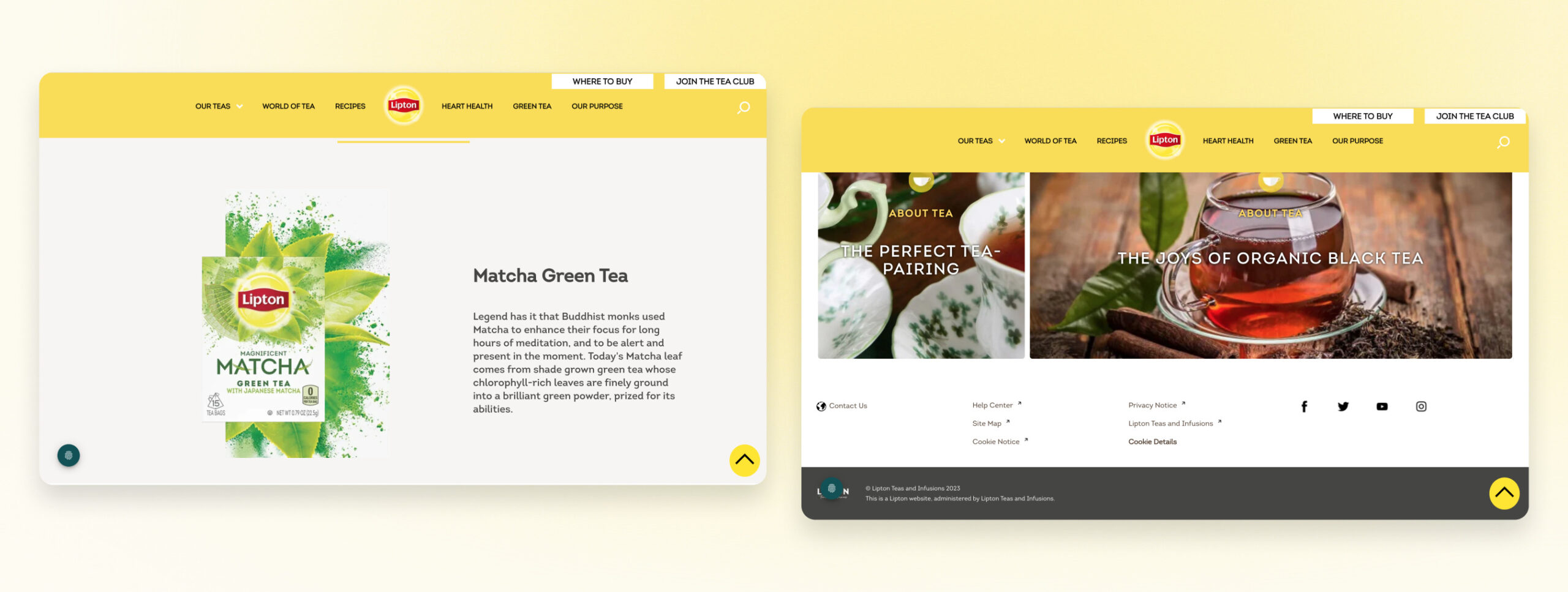
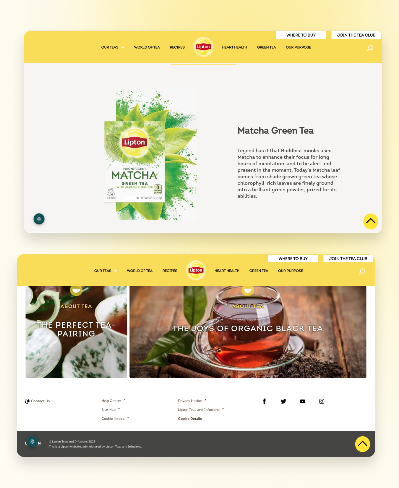
The above-the-fold section has been streamlined to feature a single image, accompanied by interactive points that enable users to delve into the production process of Lipton’s tea. In the new design, blog thumbnails include excerpts from the text, tags, and user-friendly filtering options.
My Design of Above the Page Fold Section and Blog Section
Current Design of Above the Page Fold Section and Blog Section
My Design of Above the Page Fold Section and Blog Section
Current Design of Above the Page Fold Section and Blog Section
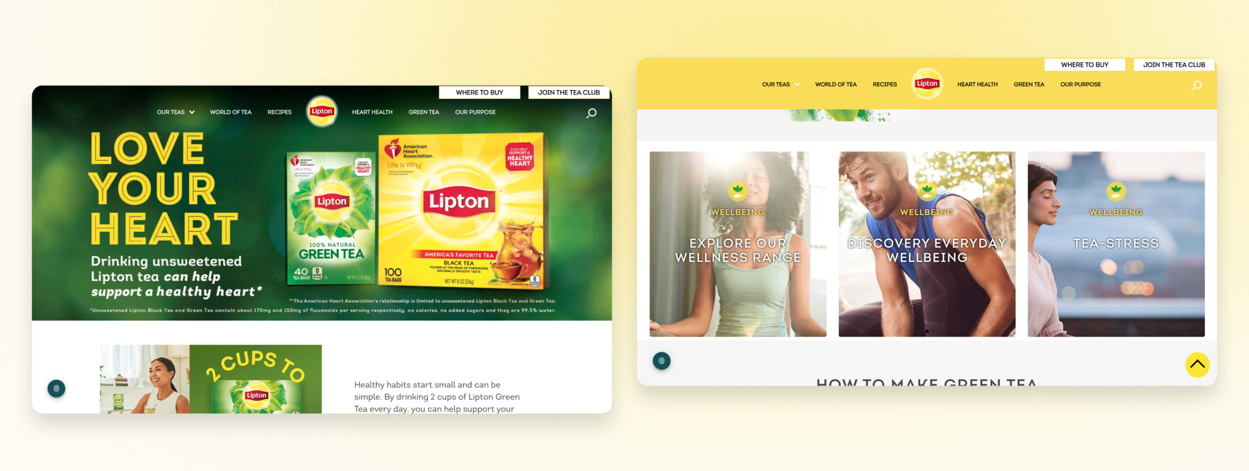
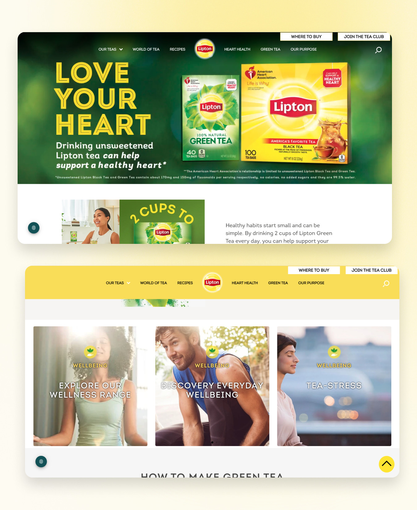
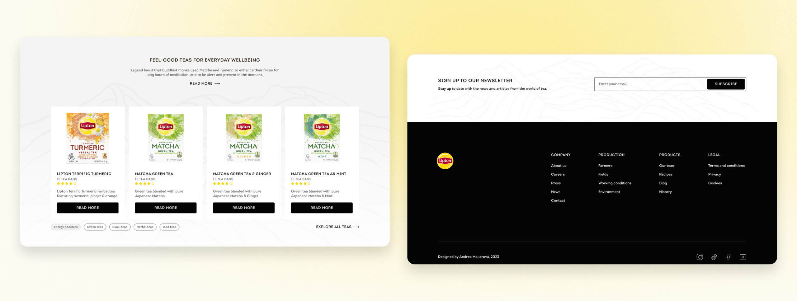
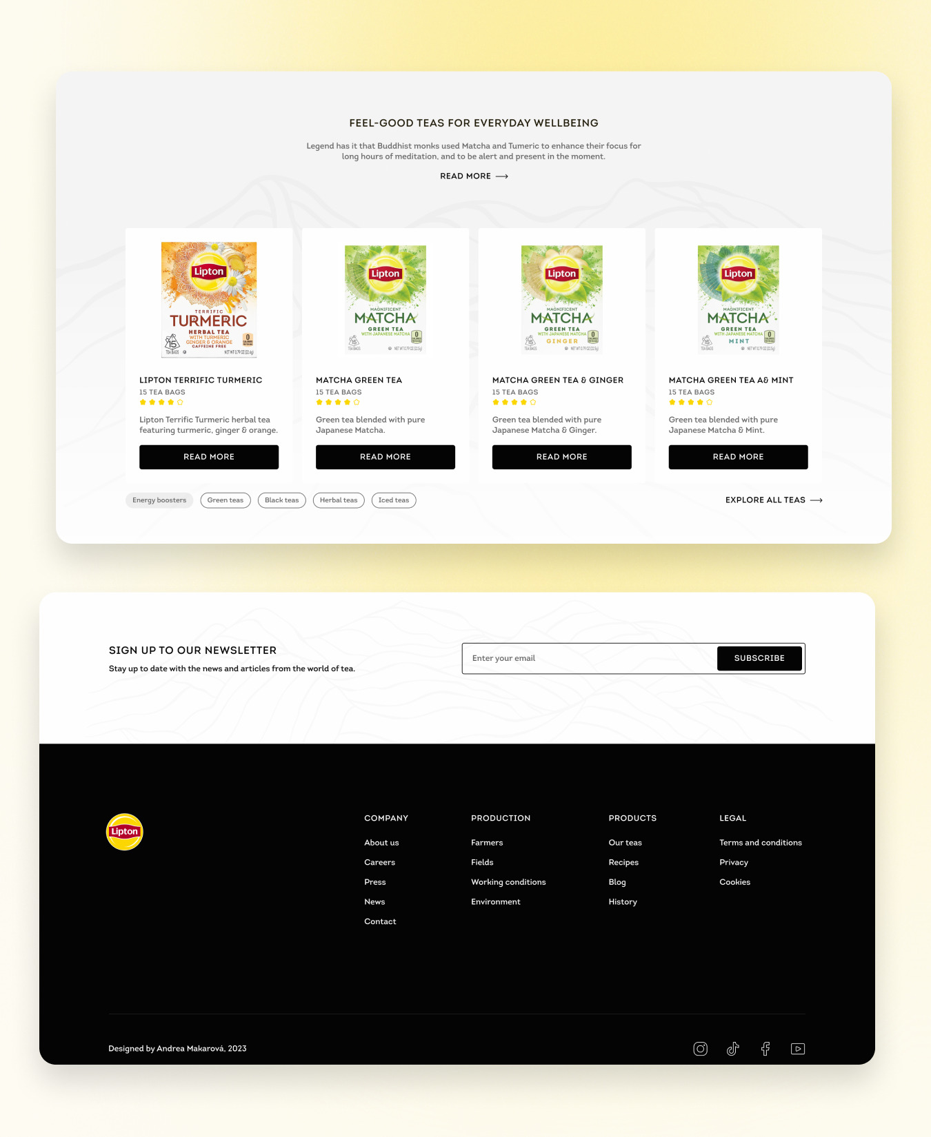
The products section on the homepage has been enhanced to showcase selected products, providing users with the flexibility to change categories and explore a comprehensive range of options. Meanwhile, the footer section has been revamped for increased clarity, offering additional information and featuring an option for users to easily sign up for the newsletter.
My Design of Products Section and Footer Section
Current Design of Products Section and Footer Section
My Design of Products Section and Footer Section
Current Design of Products Section and Footer Section
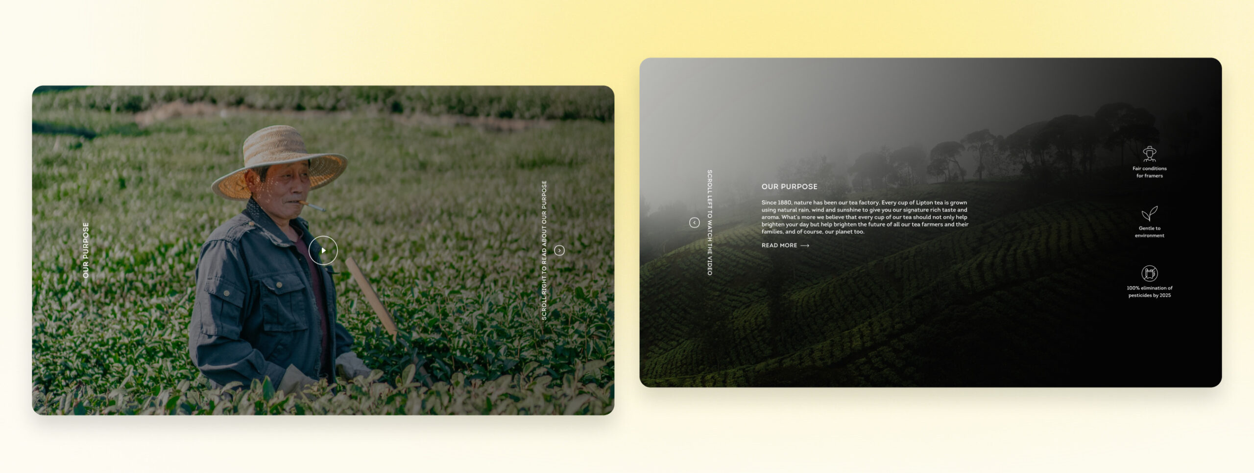
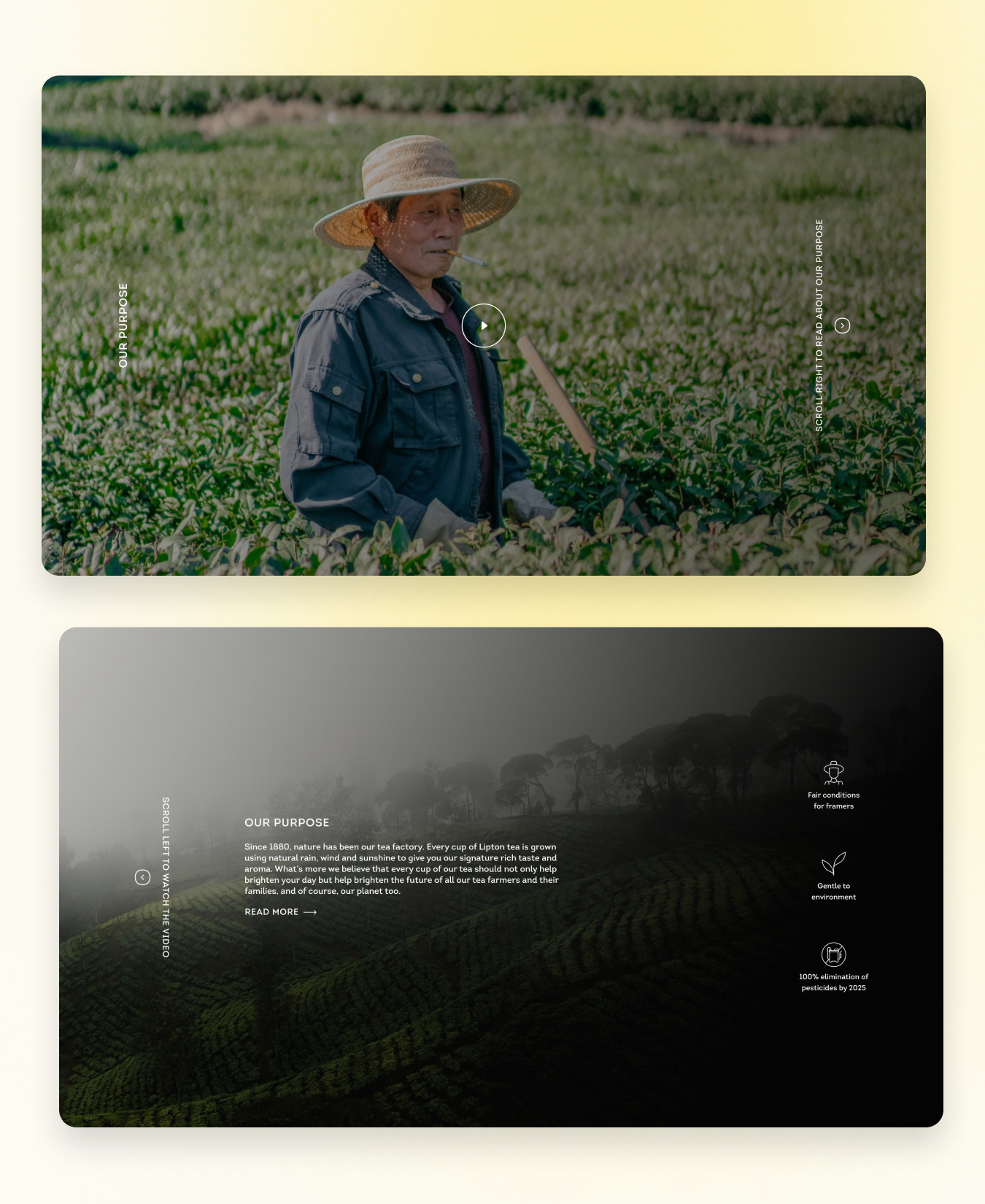
The company section has undergone a visual transformation, incorporating dynamic elements such as videos and icons. This updated design facilitates a more in-depth exploration of the company’s purpose, providing users with a richer and more engaging understanding of the organization’s values and mission.